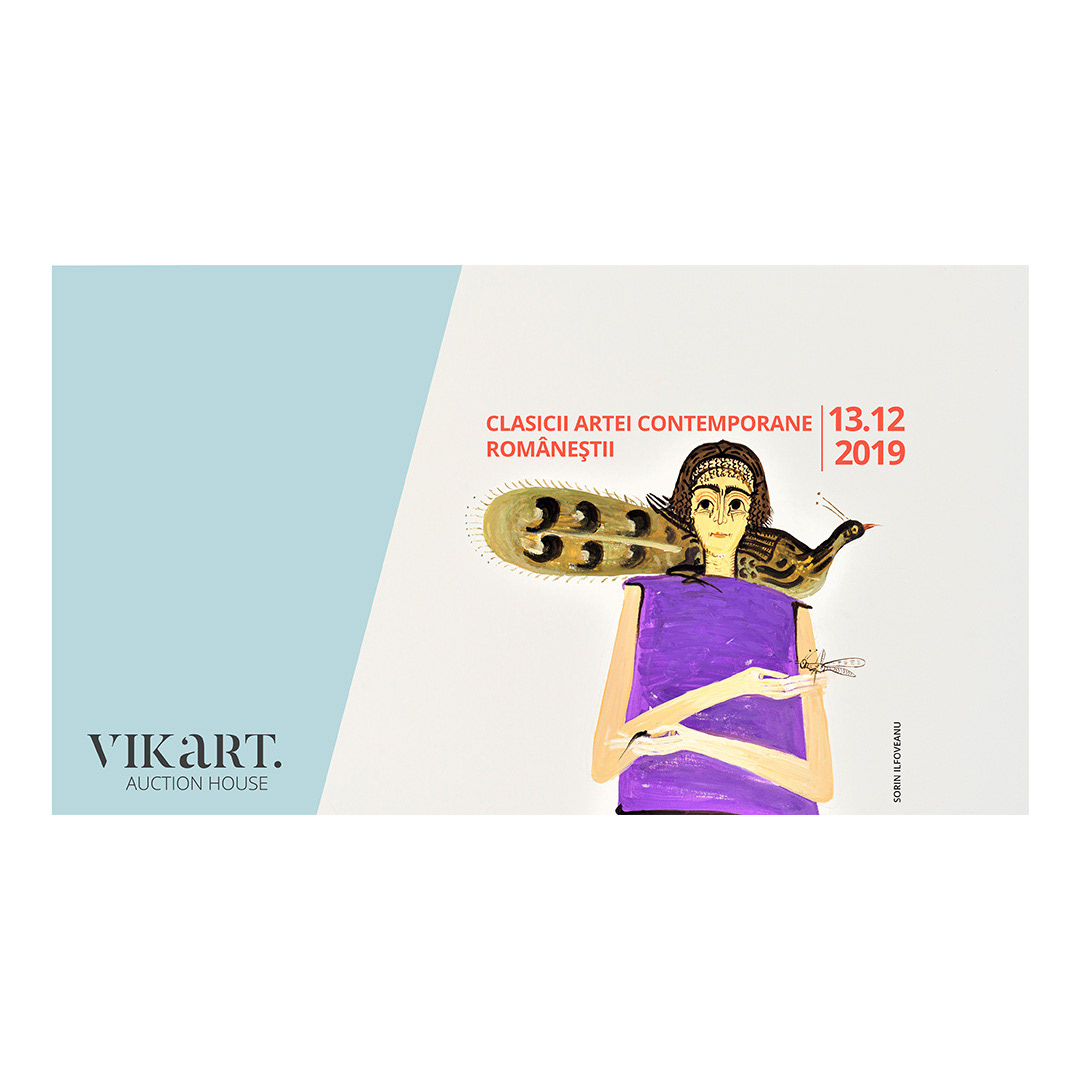
Visual Identity for the Vikart Auction House
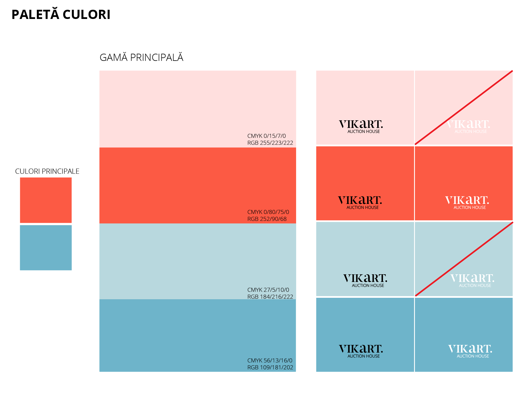
In order to develop a strong but also contemporary Visual Identity, we started out by choosing a serif font for the Wordmark. We found a stencil version of the Butler font which also brings the idea of street art in question, thus making the logo a contemporary one. We decided to end the logotype with a dot that brings the reader’s attention to the “art” part of the brand’s name. Spelling the letter “a” in the lower case helps highlight it even better.
The Wordmark is followed by a Sans-Serif Tag line, stating the nature of the brand’s activity. We deliberately did not include any visual elements like gavels as they would have easily been out of fashion in a short time.
The Wordmark is followed by a Sans-Serif Tag line, stating the nature of the brand’s activity. We deliberately did not include any visual elements like gavels as they would have easily been out of fashion in a short time.